Welcome

Thank you for visiting my blog. I hope you find interesting ideas and inspiring images. Any feedback or suggestions would be appreciated! Check out my facebook page.

About Me

My photo
My name is Gerrie Wydeven doing-business-as Wydeven Designs. I have been conducting this small GREEN business since 2004. Wydeven Designs, based in the Atlanta, Georgia area, sells CHAIRS, LOVESEATS, CHAISES, SETTEES and other fine, well-constructed refurbished upholstered pieces. I love to travel, cook, take photographs and generally follow style and decor topics as well!
Showing posts with label pinterest. Show all posts

Friday, January 23, 2015

Pinterest Dreaming with My Lovely Pieces

Every so often, I have been adding  a "pinterest dreaming" posting juxtaposing one or more of my lovely pieces with images I have saved on my pinterest boards. It is an opportunity to analyze how well the pieces work in currently decorated and curated settings and validating decisions I've made about fabrics and finishes. It's also fun! Here is the link to all my boards - pinterest. Source of all images not my own can be found on the boards.

I did the woodwork refinishing on these USA made French style pieces and they were just recently completed. The set of chairs is already in NYC and the settee will probably not be around long. I love it and would love to ditch some of my own things just to find a home for it!
I think either of these stylish chairs would work in this type of layered neutral setting. You really cannot go wrong with a neutral piece! 
This chaise lounge is a little more contemporary looking than most of my pieces. I do love its sleek look and soft, sumptuous fabric, VERY comfortable as well - I have a chaise lounge in my bedroom and it is my favorite place to read/nap. This chaise is currently available through One King's Lane - link. 
I have been acquiring and selling these wonderful "European Linen" pieces from a local colleague/collaborator for over two years now. The finish that she applies is a hard lacquer in a distressed cream color. Most of the fabrics are cream linens with some other neutrals mixed in. This set is available through Etsy and eBay - link. The latest sale from this collection (a simple bench with pale seafoam linen) sold yesterday on One King's Lane. I love these pieces!
I do not do many independent ottomans (separate from chairs) but this square one was an exception. I think it would be wonderful in front of a sofa or settee. It is available through One King's Lane - link.
Well that was fun! I tried to find last similar posting but it has been a while. Next time, a report on my business/pleasure trip to Florida!


Wednesday, February 12, 2014

Dreaming in Gray - a BIG 2014 Color!


Shade of Gray - A BIG color for 2014!
source via my pinterest board
Today is a cold, rainy, snowy-mix day in Atlanta and it has inspired me to look for the brighter side of this color choice.  Gray, in all its permutations, is one of the big colors for 2014.  It is a color with surprising range from dark and "calm/cold" to lighter and livelier. It is a neutral that works with almost any other color - particularly with splashes of brighter colors.
A mix between black and white, gray is by definition a neutral. But its varying shades, from light dove to dark charcoal, make gray as versatile as any color. article on Better Home and Gardens website - source 
The color grey doesn't have to be dull, cold, and boring. It can actually be quite hip and romantic. Depending on the shade, it also matches and coordinates with about any color in the rainbow. link to eHow article - source
love the addition of yellow - see source above
A splash of orange - see source above
I have a client in the area who is renovating a wonderful late 30's house in the historic Marietta area - a northwestern suburb of Atlanta. Her primary color choice is gray and she and her husband have created the most amazing kitchen primarily using various shades of gray and other neutrals (great expanses of marble). She has purchased almost a dozen chairs and other upholstered pieces from me in various shades of neutral - all to go into this wonderful setting. Her only two color exceptions have been a deep blue velvet wingback chair and a patina-rich green caned accent chair.  She is convinced and has convinced me that all shades of neutral work well with gray but also that an insertion of a key other color can be wonderful. She has promised me that I can come back into her setting once it is all finished to do some photography - so with any luck, there will be one or more postings on this subject in the future.
Select a third color to bring interest into your room. Depending on the shades of grey you're using and your décor, you may want to choose a third color to liven things up. If you have a modern décor, this color could be black. If you have a formal look, you may want to incorporate silver or blue. A splash of red or green will bring excitement to your rooms. Source

Here's a great color palette with various shades of gray and golds - see source above

Friday, November 15, 2013

The Fine Art of Collecting - Eclectic Style

Example of Eclectic Design - link to my pinterest board for source - "eclectic design"
I look forward each month to the arrival of my decorating magazines - I think I get all of them. I lovingly study each decor (mostly but not totally skipping the advertisements of which there are many) and find that the images enrich my understanding of decorating and decorating trends. The November issue of Veranda (link to website) arrived yesterday. One of the articles discussed the philosophy of a homeowner/designer: "The Paris born, New York based designer is from the old school of connoisseurship, where the goal isn't to create an instant room but to take great pleasure in discerningly selecting each and every object ..."

This is exactly my own approach to decorating (although my means are not as great as his - by a long shot). I think the type of decorating called "Eclectic Style" works that way. It mixes and matches pieces and periods to achieve a personal and far more interesting living environment - one that does reflect your personality and taste far more than any "assembled" room ever could. Collecting over time also allows for changing taste and interests - whether in use of wood tone or painted woods, colors and fabrics, art collections, or just "finds" - those pieces and objects you find that you WILL make room for because you love them!

For me, evidence of eclectic design include some or maybe most of the following:

  • Mixture of styles of furnishings and periods (antiques with modern, French country with Pottery Barn)
  • Mixture of wood tones including some painted furniture 
  • Mixture of art and decorative pieces - traditional and modern 
  • Mixture of high-end and low-brow - some great pieces that will last a lifetime with gifts from kids/grandkids, home-made and personal 

I perused my pinterest boards for good examples of eclectic decorating style and, of course, looked at my own refurnished furniture collection which I think works beautifully to support this style. Enjoy!

I love this setting with its various eclectic elements - painted and wood-tones, leggy and skirted furniture, mismatched lamps, and different furniture styles - see source above.
Here is a great example of mis-matched wood-tones and styles - the bamboo legged chair with the squat-footed sofa and turned-leg ottoman - nice combinations all! See source above.
This bright green chair adds an eclectic (and electric) look to this contemporary space - see source above.
AI think all spaces need a French style piece like this great cream bergere - note the different leg styles in this setting. I also am loving metal tables like the end-table here - a nice contrast to all that heavy wood - see source above.
This is a good example of the contemporary (check out that mirrored coffee table) with antiques and a traditional style sofa - see source above. 
Here are some pieces from my 2011 collection that would work in the same space and have very different styles and fabrics. 

Thursday, November 7, 2013

Pinterest Dreaming - My Beautiful Pieces in Well Designed Settings

Every now and then, I "combine" some of the photos of well designed settings that i have saved on my pinterest boards with my fine refurbished furniture to visually depict how well the pieces complement the space. It helps me picture the various combinations possible and confirms the fine fabrics selected for the pieces. For this session, I only pulled photos from my "Decorating with Yellow" pinterest board link to my board and source of all setting photos below.

Yellow is one of my favorite colors - it is always cheerful and surprisingly versatile as demonstrated in these settings. Most of my house is yellow - all major walls (except bedrooms) are yellow and I have not grown tired of this color.

Here are some of the nice combinations - all my items are available on Ebay or Etsy - my website is, unfortunately broken and I need to just take it down - it is totally out-of-date. Some of my pieces are available through the premium, curated site "Charish" (but more expensive on that site).

I love the combination of black and white and this nice antique settee is fully brought up-to-date in this color combination. The woodwork was redone in Annie Sloan Chalk Paint graphite. I can easily see this with all the bright colors of the rainbow or in a more subdued grey/black/neutral setting- link to Etsy listing
This sophisticated setting highlighted a bright Palm Springs, CA, home. The blue is the most eye-catching feature in the room and my chair and ottoman would complement it beautifully - link to eBay listing.
I love this yellow with a slight hint of green color. The tailored slipper chair and ottoman would work well in the setting. 
Ahhh, what a soothing combination! I love the green and yellow look! These great chairs are upholstered in the best ultrasuede money can buy (retailed at over $100 per yard at Calico Corners) - the chair itself is a Woormark - very fine USA-made furniture link to Charish listing.
I love this tall and graceful chairs with their Annie Sloan Chalk Paint finish (graphite) and grey linen outlined in cream. They would work so well in this and other settings.
These stylish chairs would work well with yellow walls and also would coordinate nicely with wood-tone pieces. It is hard to see but there is a dark taupe/brown in the pattern as well as black and cream.
One of my favorite pieces - it has a wingback chair that matches. It may not be ideal for a bedroom setting but if there is space for it (it is tall but not deep), it might be a delightful surprise in a room like this!
I love houndstooth fabric and particularly in this popular color. With a footstool, this becomes a very comfortable reading and snoozing chair!
Finally, yellow with yellow - bright sunshine all around!
I love all of these combinations and bet I could go to one of my other color boards on Pinterest and find another set of images that would work as well!

Monday, October 28, 2013

Loving Annie Sloan Chalk Paint's Emperor Silk!

Red on this camper is ASCP Emperor's Silk (five colors used altogether) - link to image and source
Having recently returned from China (see my "postcards from China series - here is one - link to posting), I must still be under that country's magical influence. I purchased Annie Sloan Chalk Paint (ASCP) (link to website) most "Chinese" color - Emperor's Silk. It is a rich red and a joy to work with - I have almost completed four projects and am looking around for more!

For those keeping track, I have now been using ASCP for two years - mostly on my refurbished upholstered furniture sold through eBay and Etsy (my website, unfortunately, needs to be "killed"since I can no longer update it and it is woe-fully out-of-date). I am probably close to a hundred projects and have used the following colors:

Old White (I'm on my third can)
Old Ochre (second can)
Graphite (third can)
Duck Egg Blue (my favorite until now)
Paris Grey (least favorite)
Chateau Grey (like a grey-green)
Cream
CoCo
Emperor's Silk (new favorite)

The paint does go on very smoothly and I continue to fine-tune lessons learned including:
  • Start with a good cleaning of the wood to eliminate dust and oils (I used Goof-Off - link to website - it's heavy-duty and you do need heavy gloves but it works.
  • If there are gaps or gouges in the wood, fill them before painting - the paint will not hide them and will actually highlight them.
  • Do your first coat starting with the piece upside down - I am always amazed at how much I miss if I don't do this. 
  • Dilute the paint with a small amount of water if it gets too heavy or doesn't glide easily over the surface.
  • Use a toothbrush or other stiff applicator when applying wax into crevices - I am told the ASCP brushes work well for this but haven't made that purchase and do like the ability to just throw away these old toothbrushes when done - clean-up of wax is much tougher than clean-up of paint  which is easily done by rinsing under water.
Here are some photos from my ASCP pinterest board to further inspire - I love them - see sources and original postings by linking to source above.

Nice combo of paint and wood-tone treatments. 
This is demonstration using dark wax directly over the paint instead of intermediate clear wax - much darker look. 
Chest using both clear and dark wax. 

Very ambitious! 

This piece was first done with graphite (grey-black) and a second coat of Emperor's Silk added.


Here are my projects!


After "finishing" this set of benches, I did end up taking a very small brush to better hit the crevices/details on the legs - these were hard to penetrate. 

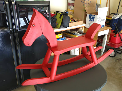
Loved how the horse turned out - will be using as part of my holiday decorations - probably with some bears on its back!

Wednesday, October 2, 2013

Decorating by Color - Black and White

Black and White Image - from my Pinterest board Decorating in Black and Grey
I have always loved the crisp clean look of black and white decor (with just about any pop of color imaginable). As a poor college student, I painted wooden boards a shiny black and placed them between bricks and white mortar board to create elaborate bookshelves and places to put things like the small television we had in those days. I painted matching old tables and dressers and had a very "sophisticated" flat!

Fast forward (many years) and I still love the look of black and white and find it to be an easy way to create sophistication and elegance in any space.
Black and white décor is an affordable way to make your home look sophisticated, elegant and dramatic. You can easily transform any room into this style by repainting old furniture and purchasing a few basic accessories.  Link to article
This color scheme may be the easiest to accomplish. There are no tricky color coordination challenges and just about ANY other color will coordinate well. I found many articles on the subject but feel that the actual photos were the best advocates for this great color scheme. Some of my pinterest boards are set up by colors and I have one showing a lot of black and white images. Of course, most of my emphasis is on upholstered pieces but the scheme works well with all furnishings. The images below are all from my board (see link above) and the original sources are there as well.


I always have some items in my inventory of fine refurbished upholstered pieces in this great color combination but I must be truthful here - they do not sell well. They sell eventually but not quickly. I am always amazed to see how hesitant buyers are about using this great color combination. I get a lot of compliments but the buyers are slow to come forward - an interesting paradox!

Here are my latest black and white pieces - available on eBay and Etsy - you can also contact me directly at wydevendesigns@comcast.net.  Enjoy - and let's see if my prior experience is wrong on these beauties!


Monday, September 2, 2013

Unusual Uses for Annie Sloan Chalk Paint

It is now going on two years that I have been using (and loving) Annie Sloan Chalk Paint link to website. I have mostly used the very versatile chalk paint on refurbished upholstered pieces and have limited my finishes to regular (just paint and clear or dark wax), distressed (some sanding away of finish), and dry brushing of one color over the other. All of these have worked very well.


I have set up a pinterest board for Annie Sloan Chalk Paint and have been collecting tips and techniques as well as images to inspire my work. I have been AMAZED by some of the more creative uses of this great product and this posting features some of those applications.  All of these images and explanations are available on my pinterest board - link to my board.

Love this "stone" look on lamp base. 
Clever !
Chalk paint plus gilding on brass fixtures - this really updates this look! 
WOW - perfect for upcoming halloween celebrations! 
Paint inside of these jars - what a nice look for simple and cheap glassware!
Snowman! 
This is a nice way to take different frames and create a coherent set for any decor. 
These are fabrics painted with chalk paint - I am still not sure about this!
Well on this labor day, this seemed like a nice topic for inspiration! It is raining outside (again), so I may just finish up my current ASCP projects and move onto something a little different!