Welcome

Thank you for visiting my blog. I hope you find interesting ideas and inspiring images. Any feedback or suggestions would be appreciated! Check out my facebook page.

About Me

My photo
My name is Gerrie Wydeven doing-business-as Wydeven Designs. I have been conducting this small GREEN business since 2004. Wydeven Designs, based in the Atlanta, Georgia area, sells CHAIRS, LOVESEATS, CHAISES, SETTEES and other fine, well-constructed refurbished upholstered pieces. I love to travel, cook, take photographs and generally follow style and decor topics as well!
Showing posts with label decorating trends. Show all posts

Sunday, March 22, 2015

The World of Settees


I was perusing a House Beautiful magazine (link) and happened upon an article entitled "The World of Settees".
The versatile, streamlined settee can go where the more substantial sofa cannot - a narrow hallway, a living room nook, in place of a banquette at a dining table. 
I would add:
  • end of a bed
  • office 
  • sunroom 
  • in front of a fireplace
  • ANYWHERE!
The article includes photos of about two dozen settees demonstrating multiple shapes, sizes, designs, fabric treatments and decorating styles. The largest width was 72" but most were quite a bit smaller.

I love settees and do include them in my Wydeven Design collections. My rule of thumb about acquiring pieces is that they must fit into my trusty minivan (Honda Odyssey) and settees do fit the bill (while sofas do not). In putting together this article, I looked at settees that are (mostly) currently available and was quite surprised that I had so many - and now do better understand why my storage capacity is stretched to the limit.

Here are some of the nice pieces - quite a variety!

This lovely shade of blue would work in most of my house! 
This is the most "modern" of the settees but would really work anywhere.
I am a sucker for silk - even though it does require some care in placement (away from direct light and potential exposure to water). This one is so lovely! 
This one is going to Auburn, AL - wish I had a dozen of these! The companion bergere chairs found a home in NYC.
I do not often have a pair of settees and these are as nice as can be. Their lower profile would work well in many settings.
I just love this sweet piece!
This nicely sized settee is just out in time for a Spring debut! 
My European Linen Collection settees never last long - I have another one ready to be listed. These are all in new homes. 
One of my favorites! This one is already in a new home in California!
Well, I continue to acquire settees - have two more "in production". They work well in so many settings!

Wednesday, March 18, 2015

Decorating in Reds!

LOTS of red in this room - see pinterest board for details and origin (link)
Now this is a stimulating room - see pinterest board for details.
I love the color red and would love to see more of it in home decor. I have a pinterest board dedicated to the subject (link).  It is a color that I've used extensively in my own home. I have a traditional/transitional style in my living and dining rooms anchored by Chinese red rugs. The color may not be at its height of popularity right now (although "burgundy" is a 2015 color of the year), but it never entirely looses its advocates and is a favorite for many designers.

Red 101
When people walk into a red room, they immediately respond,” says New York City interior designer Scott Sanders. Color experts describe red as a stimulating shade. It grabs focus (think stop signs and fire engines) and, on walls, becomes the defining element of a space.link to article
One article I found talks about how to incorporate red into a variety of decorating styles - with an emphasis on walls and woodwork:

Contemporary design incorporates neutral elements with pops of bold color, often red.On the door: Bold, bright redInside: Bright red shades in a pillow, rug or throw Modern design calls for all kinds of reds: from primary hues to classic shades with burgundy or brown undertones.On the door: Any red you love that makes a statement.Inside: Consider injecting red through a painting or piece of art. Traditional design stays away from primary reds and instead involves burgundy or black tones.On the door: A deep, rich redInside: Decorate with Oriental rugs injected with darker reds. Transitional design relies on a neutral palette, a perfect canvas for pops of red.On the door: Match this red to hues you use inside the home, or skip the red door entirely to keep a more neutral theme.Inside: Choose a softer and more indirect approach like a red lamp or piece of art. Country reds are chalkier and softer: Think barn or scarlet reds. Choose reds with pinkish and purplish hues, like the color of a ripening apple.On the door: Barn redInside: Accessorize with country reds in knickknacks and fabrics.link to article

Illustration of Country Red decor - link  
I love the red "pops" in this space - a good example of contemporary design - see pinterest board for source information
This is a little dark for me but does illustrate how reds can brighten and energize the space - see pinterest board.
Lovely space - I would call this one transitional! 
Red in a French Country style - love the fabrics used here - see pinterest board for details.
 I always have a few reds in my Wydeven Design Collections but never more than a few. Truthfully, they do not sell as well as either neutrals or blues but they certainly do need to be available for those discerning clients who want that pop of color in whatever decorating space/design they like! My pieces are currently available on Etsy, eBay and One King's Lane!

I was surprised at how few pieces I had in this great color last year - I have to try harder this year!
I love this stripe and wish I had more than just enough for one small chair. 
I bought this fabric in four colors - love the red version! 
A great piece for a patriotic themed bedroom!
I do love reds and wish more people were bold enough to use them in their space - they really could not go wrong with this great energetic color.


Thursday, March 5, 2015

Fabrics Can Bring the Garden Indoors!

I read an article yesterday in one of my many decorating magazines/websites that discussed the idea of bringing the garden indoors via the selection of fabrics (and colors). We are all impatient for Spring to arrive and this seemed like a worthy topic for a posting. I also happen to love floral/garden patterns and have quite a few in my current Wydeven Design offerings. I am increasingly pleased to see that florals are making a comeback and are very prevalent in today's decors - there is decidedly a trend away from the somber solids and the ubiquitous neutrals.

SO, here, in pictorial tribute, are some great examples of ways to bring the garden inside!


All of these remind me of outdoor gardens and spring/summer colors - a nice way to keep the home in a garden state of mind!

Sunday, February 22, 2015

History of Buffalo Plaid Fabrics

Recently sold and delivered French style chair (one of a pair) in teal buffalo plaid!
I have loved buffalo plaids ever since I can remember. The oversized "check" makes any piece of furniture it is on look amazing.

I found this interesting bit of information about the origin of the design dated July, 2014:

It has been noted that Buffalo Plaid is making quite the comeback this season. What many people may not know is the history behind the Buffalo Plaid and how it received its interesting name.  
Originally a Scottish product, Buffalo Plaid traces back to the 8th century and is ranked the oldest Tartan. This particular Tartan became a symbol of the MacGregor clan, a family known for being furious warriors. Because of this, the MacGregors were banished from Scotland by King James VI in 1603 and thus moved to Canada. Buffalo Plaid first made it's appearance in American fabric history in the late 1800s when the Scottish Big Jock McCluskey (MacGregor) from Canada settled in Connecticut. McCluskey did many things during his time in America all while living off of buffalo hunting. After the Battle against the Indians in the Battle of the Little Big Horn, McCluskey bartered for buffalo pelts with the Sioux and Cheyenne and, in return, the natives received the heavy woven Scottish blankets from McCluskey's native home, made of a fabric now known as Buffalo Plaid. link to article
 I do buy this oversized scale fabric whenever I can and wish I could find more (at my price points, of course). Here are some of my favorite transformation using buffalo plaids.

I bought this fabric at Calico Corners Fine Fabrics several years ago. It was not selling well and I bought every piece I could find at about 70% off.  
This lovely dark cream and teal combo was purchased on eBay - I used it on at least four pieces and have enough left-over for another small set of clubs or a similar larger club and ottoman set as above.  
This bluer teal with paler cream combo was just completed and sold to a family in a suburb of Houston. My husband and I delivered it ourselves and saw the beautiful job they were doing renovating a gracious home in the suburbs.
So, I will continue to look for these nice patterns and hope to expand my supply and color choices!

Friday, February 20, 2015

Loving the Colony Hotel in Palm Beach

Colony Hotel - Palm Beach - from their website - link

During our recent trip/vacation to the Palm Beach area of Florida (east coast), which happened to coincide with our 28th wedding anniversary,  my husband and I stopped by the Colony Hotel for their famous pool-side lunch. The hotel is located near Palm Beach's version of Rodeo Drive, Worth Avenue. Interestingly, the reason we stopped here was not because of any prolonged research and planning process but because my husband forgot his cell phone in the car and left me standing on Worth thinking about lunch options. I stopped several passers-by who looked like they might be "natives" (you can tell in this tony area) and asked for recommendations. Both suggested this spot without hesitation - even saying it was better than the famous Palm Beach Breaker's Hotel food and ambience - which is saying something!

Loved the interior of the hotel - soothing shades of greens! 
I was immediately intrigued by the lobby area of the hotel decorated in shades of green and teal - very soothing and a little wild.

I found a year-old article about the 2014 renovation of the hotel:
PALM BEACH, Fla. --  Facelifts are as common as blue skies in Palm Beach, so it was only a matter of time before the famed Colony Hotel had some work done.
Taking the 67-year-old hotel from worn to wonderful, from staid to stunning was renowned interior designer Carleton Varney. Known as “Mr. Color,” he used pinks and greens, sea blue and coral to bring out the Southern charm of the family-owned hotel that is steps away from the shopping mecca of Worth Avenue. Since 1947, the hotel has hosted the  Duke and Duchess of Windsor, President Bill Clinton, John Lennon, Frank Sinatra and many more famous names. link to article
WOW - I loved the space and how it had been transformed.

More details - Colony Hotel in Palm Beach
 From the article I discovered that there were many more beautiful areas to explore within the hotel but I was pleased to have seen what I could.

Lunch at the Colony's poolside restaurant was very nice!
The pool-side setting of their restaurant was very pleasant. I believe my husband particularly enjoyed the views including a bikini-clad guest who was perched practically at our table as she lounged cooly by the pool. Of course, I could be mistaken, maybe he was just looking at me!!

Thursday, February 5, 2015

Chaise Lounges at the End of the Bed - The Flagler Museum Example


Flagler Museum in Palm Beach, Florida - link to website

My husband and I just returned from a relaxing week in Florida - staying near Palm Beach. The weather was cool for the natives (low to mid 60's) but great for us escaping a rather cold, wet winter in the Atlanta area. We had never visited this particular area before and enjoyed taking advantage of many local sights. One of our favorite areas was Palm Beach itself (an island - who knew). It is, of course, famous for its rich residents and its palatial homes (think Donald Trump, Jimmy Buffet).

View from back of Flagler Museum 
One of the earliest settlers was Henry Flagler who appears to be a major founder of all strategic water-front cities on the east coast of Florida. A Standard Oil baron and contemporary of John D. Rockefeller, he fell in love with the beautiful weather and sought to tame the less than stellar natural environment (water-logged, scrubby vegetation, alligators). He built a railroad that initially traveled all the way to Key West and built hotels and homes along the way. One of his lovely homes,  a wedding gift to his third wife, was this beauty on the Intercoastal Waterway. His estranged son's daughter bought it and turned it into the museum we see today. 

When it was completed in 1902, the New York Herald proclaimed that Whitehall, Henry Flagler's Gilded Age estate in Palm Beach, was "more wonderful than any palace in Europe, grander and more magnificent than any other private dwelling in the world." Today, Whitehall is a National Historic Landmark and is open to the public as the Flagler Museum, featuring guided tours, changing exhibits, and special programs - from website above.
We had a wonderful docent-led tour of the home and opportunities to take photos of the interior which has maintained much of the original decor and furnishings. I, of course, checked out the upholstered pieces - many of which I would have loved to cart away. One of the decorating trends I noticed was the placement of chaise lounges in most of the bedrooms and often at the end of the beds. This is a design element I particularly like and I think chaise lounges are a great addition to any bedroom - space permitting.

Here are some of the examples - I wish I could get my hands on some of these great styles:


I have a number of settees underway. They do take up a lot of space so I can't overdo them in my inventory. I just sold a custom chaise lounge to a client in Maryland and she has asked me to be on the lookout for another one - she loves a skirt-less look with interesting woodwork and down cushions - so comfortable.
Here are some chaise lounges from my archives as well as my pinterest board on the subject - enjoy - link to pinterest board

Sunday, January 4, 2015

Decorating Myths - Use of Multiple Patterns


Demonstration of Mixed Patterns from Article Below.

MYTH: Choose one pattern to be the star of the room

REALITY: Through artful pairing you can feature two, three—even five!—fabulous patterns as long as you keep the color scheme similar, and get creative with scale. link to article

Designer Charles Faudree
An article in Veranda Magazine got my attention. It debunks 10 myths about decorating and one is about the use of patterns. It reminded me immediately of a customer I am working with who loves Charles Faudree link to pinterest page highlighting his decors, the internationally known interior designer (unfortunately no longer with us). His trademark look, besides his sweet Cavalier King Charles Spaniels, was French Country and he loved to mix 3, 4, 5 even 6 patterns.
Interior designer Charles Faudree, long a favorite of Traditional Home readers, was known for his fondness for all things French. He was based in Tulsa, where he had an interior design studio and shop. The multitasking and highly versatile designer—who enjoyed an international following—wrote popular books on design, led design tours of his beloved French countryside, and designed wallpaper and fabric. He designed both quaint cottages and lavish formal homes. “I’m a big believer in the mix,” he said. “A single object on a tabletop or a single work of art on the wall can be nice, but for me, mixing collections provides the most excitement.” link to article.
 My customer (homes in Maine and Maryland) is decorating the latter home and wants to invoke the spirit of Charles Faudree in her selection of fabrics and particularly patterns. I am loving the collaboration as we find and refurbish several French style wing chairs, a leggy chaise lounge and a compact settee.

In support of the notion of putting together multiple patterns, I pulled some photos from my 2013 and 2014 collections and feel that they do work together very well.  There may be some obvious lessons here!


Just reviewing my choices, I drew several conclusions:

Mixed patterns work when:


  • patterns and colors are clear and crisp - not too many colors or too complex of a pattern
  • some of the patterns are stripes and checks which work with any graphic or floral pattern
  • colors are complementary or in the same color group (except blues - see next point) - I love combos of green and blue as well as yellow, blue and white
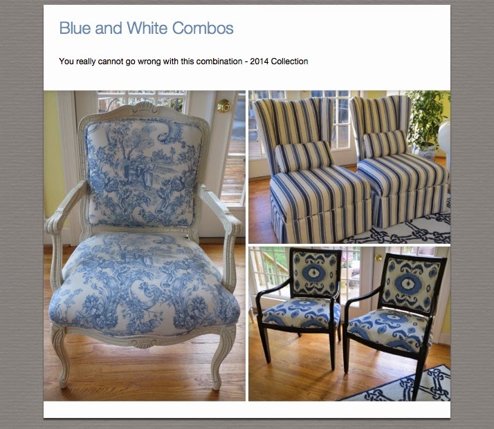
  • including many variations of blues and whites (some designers feel you can never go wrong with blue and white combos unless you have too little variation in the color hues)
  • space for solids is allowed in the mix - it could be the walls, larger furniture pieces (e.g., sofa) or window treatments

I enjoyed reviewing (and debunking) this myth and hope it will encourage others to be more willing to play with patterns. What are your favorite pattern mixes?