Welcome

Thank you for visiting my blog. I hope you find interesting ideas and inspiring images. Any feedback or suggestions would be appreciated! Check out my facebook page.

About Me

My photo
My name is Gerrie Wydeven doing-business-as Wydeven Designs. I have been conducting this small GREEN business since 2004. Wydeven Designs, based in the Atlanta, Georgia area, sells CHAIRS, LOVESEATS, CHAISES, SETTEES and other fine, well-constructed refurbished upholstered pieces. I love to travel, cook, take photographs and generally follow style and decor topics as well!
Showing posts with label fabrics. Show all posts

Thursday, March 5, 2015

Fabrics Can Bring the Garden Indoors!

I read an article yesterday in one of my many decorating magazines/websites that discussed the idea of bringing the garden indoors via the selection of fabrics (and colors). We are all impatient for Spring to arrive and this seemed like a worthy topic for a posting. I also happen to love floral/garden patterns and have quite a few in my current Wydeven Design offerings. I am increasingly pleased to see that florals are making a comeback and are very prevalent in today's decors - there is decidedly a trend away from the somber solids and the ubiquitous neutrals.

SO, here, in pictorial tribute, are some great examples of ways to bring the garden inside!


All of these remind me of outdoor gardens and spring/summer colors - a nice way to keep the home in a garden state of mind!

Sunday, February 22, 2015

History of Buffalo Plaid Fabrics

Recently sold and delivered French style chair (one of a pair) in teal buffalo plaid!
I have loved buffalo plaids ever since I can remember. The oversized "check" makes any piece of furniture it is on look amazing.

I found this interesting bit of information about the origin of the design dated July, 2014:

It has been noted that Buffalo Plaid is making quite the comeback this season. What many people may not know is the history behind the Buffalo Plaid and how it received its interesting name.  
Originally a Scottish product, Buffalo Plaid traces back to the 8th century and is ranked the oldest Tartan. This particular Tartan became a symbol of the MacGregor clan, a family known for being furious warriors. Because of this, the MacGregors were banished from Scotland by King James VI in 1603 and thus moved to Canada. Buffalo Plaid first made it's appearance in American fabric history in the late 1800s when the Scottish Big Jock McCluskey (MacGregor) from Canada settled in Connecticut. McCluskey did many things during his time in America all while living off of buffalo hunting. After the Battle against the Indians in the Battle of the Little Big Horn, McCluskey bartered for buffalo pelts with the Sioux and Cheyenne and, in return, the natives received the heavy woven Scottish blankets from McCluskey's native home, made of a fabric now known as Buffalo Plaid. link to article
 I do buy this oversized scale fabric whenever I can and wish I could find more (at my price points, of course). Here are some of my favorite transformation using buffalo plaids.

I bought this fabric at Calico Corners Fine Fabrics several years ago. It was not selling well and I bought every piece I could find at about 70% off.  
This lovely dark cream and teal combo was purchased on eBay - I used it on at least four pieces and have enough left-over for another small set of clubs or a similar larger club and ottoman set as above.  
This bluer teal with paler cream combo was just completed and sold to a family in a suburb of Houston. My husband and I delivered it ourselves and saw the beautiful job they were doing renovating a gracious home in the suburbs.
So, I will continue to look for these nice patterns and hope to expand my supply and color choices!

Sunday, January 4, 2015

Decorating Myths - Use of Multiple Patterns


Demonstration of Mixed Patterns from Article Below.

MYTH: Choose one pattern to be the star of the room

REALITY: Through artful pairing you can feature two, three—even five!—fabulous patterns as long as you keep the color scheme similar, and get creative with scale. link to article

Designer Charles Faudree
An article in Veranda Magazine got my attention. It debunks 10 myths about decorating and one is about the use of patterns. It reminded me immediately of a customer I am working with who loves Charles Faudree link to pinterest page highlighting his decors, the internationally known interior designer (unfortunately no longer with us). His trademark look, besides his sweet Cavalier King Charles Spaniels, was French Country and he loved to mix 3, 4, 5 even 6 patterns.
Interior designer Charles Faudree, long a favorite of Traditional Home readers, was known for his fondness for all things French. He was based in Tulsa, where he had an interior design studio and shop. The multitasking and highly versatile designer—who enjoyed an international following—wrote popular books on design, led design tours of his beloved French countryside, and designed wallpaper and fabric. He designed both quaint cottages and lavish formal homes. “I’m a big believer in the mix,” he said. “A single object on a tabletop or a single work of art on the wall can be nice, but for me, mixing collections provides the most excitement.” link to article.
 My customer (homes in Maine and Maryland) is decorating the latter home and wants to invoke the spirit of Charles Faudree in her selection of fabrics and particularly patterns. I am loving the collaboration as we find and refurbish several French style wing chairs, a leggy chaise lounge and a compact settee.

In support of the notion of putting together multiple patterns, I pulled some photos from my 2013 and 2014 collections and feel that they do work together very well.  There may be some obvious lessons here!


Just reviewing my choices, I drew several conclusions:

Mixed patterns work when:


  • patterns and colors are clear and crisp - not too many colors or too complex of a pattern
  • some of the patterns are stripes and checks which work with any graphic or floral pattern
  • colors are complementary or in the same color group (except blues - see next point) - I love combos of green and blue as well as yellow, blue and white
  • including many variations of blues and whites (some designers feel you can never go wrong with blue and white combos unless you have too little variation in the color hues)
  • space for solids is allowed in the mix - it could be the walls, larger furniture pieces (e.g., sofa) or window treatments

I enjoyed reviewing (and debunking) this myth and hope it will encourage others to be more willing to play with patterns. What are your favorite pattern mixes?

Thursday, November 6, 2014

Fabric Trends - A Visit to ADAC


I have written two times this last week about my recent visit to ADAC - Atlanta Decorative Arts Center. The occasion was an invitation-only event called "Inside Design" co-sponsored by The Hearst Design Group (Elle Decor, Veranda, and House Beautiful) and ADAC. I attended two showroom presentations given by fabric houses Schumacher link and Pierre Frey link. The sessions were very insightful.


Pierre Frey at ADAC
Schumacher is celebrating its 125th year anniversary and has a celebrated history including two White House projects (1902 and 1962). The Schumacher presentation gave us a good look at a recent collection based on 18th century documents in their collection.

Patterns (often rendered extra large and in vibrant colors) included:
  • toiles
  • tree of life
  • flame stitch
  • leopard
  • trellis
The Pierre Frey presentation was conducted by Pierre Frey (junior) himself. The family-owned firm is coming out with its first book and he was making the rounds to highlight this launch as well as demonstrate the variability of their fabric line. It is definitely not restricted to a French look - formal or country.  He indicated that over 70% of their fabrics are still made in France.

Both presentations reminded me of why I love fabrics and particularly well designed patterned fabrics. I will keep using patterns on some of my pieces and hope that they will appeal to the "fashion forward" and "bolder" decorator/homeowners looking for something vibrant to add to the mix. These presentations definitely demonstrated that the trend continues to be timeless!


Sunday, November 2, 2014

Inside Design at ADAC - Elle Decor Trends


I received an invitation to attend the Inside Design session hosted by The Hearst Design Group (think of Elle Decor, House Beautiful and Veranda - all of which I subscribe to) and the Atlanta Design Center (ADAC).  I invited a friend to join and we spent last Thursday enjoying several sessions and having an opportunity to visit some of the over 60 showrooms at ADAC link to website.

 I tried to pay particular attention to the trends in fabrics (and to a lesser extent) and upholstered piece designs. The keynote speaker was Michael Boodro, Editor in Chief of Elle Decor.  The magazine is celebrating its 25th year. Michael discussed trends that are "over and done" and ones that are either back or timeliness.

These are some of the trends he mentioned that are "gone":

  • small prints and patterns (think French)
  • too much color
  • stark interiors
  • over stylized settings - too constrained and controlled
  • TV screen rooms
  • karate chop accent pillows (not a natural "pillow state")
  • misson and neo-gothic designs
These are timeliness and/or back:
books - Elle Decor
  • arts and crafts decors
  • red color schemes (particularly red and white)
  • blue color schemes
  • olive green color schemes
  • subtle pattern play
  • use of books in decorating

We found the presentation interesting but a little internally inconsistent. While saying small, French prints are out, several photographs shown did include those as being "timeless". While saying too much color is out, illustrations wild with color were shown.  SO ... while this discussion provided some insights, I'm not sure I learned a great deal.  I was, however, heartened to hear about the popularity of "reds" which I love but have tried not to overuse lately. I may have to ramp up my red pieces.

More postings about this event will be added over the next few days!


Monday, July 28, 2014

Last Fabric Run in July - Atlanta Fabric Marketplace

My shopping cart at Fabric World - Stone Mountain, GA
I spent some time last week shopping for fabrics with my daughter who is in the process of furnishing her new home. She has learned some valuable lessons from her dear old mom including the benefits of taking well constructed upholstered pieces and having them professionally reupholstered with designer fabrics to save $$$ and get truly unique pieces.

So far, she has used one of my fabrics to redo a set of vintage wingback chairs for the home office (look wonderful); selected one of my finished sets (Storehouse settee and matching chair) as a move-in gift; and taken over two sets of my "before" sets of chairs to redo. We were shopping for the latter pieces and ended up at several renowned fabric shops in the area: Forsyth Fabrics (link) and Lewis and Sheron (link). She fell in love with several fabrics in the $33-40 per yard range and purchased one for two of the chairs. We also stopped by Calico Corners and looked at their selection. She is still looking for the second set of chairs but has some firm ideas about where she wants to go with them. Even at the (for me) high price of fabric, she will have GREAT pieces at very reasonable prices for her home.

I, on the other hand, continue to shop at Fabric World (link) where for two months now they have been having a $3.00 a yard sale on their upholstery and drapery fabrics. The selection has not been too bad and I have been stopping by almost every week to add to MY collection. This last week, they had acquired a large load of fabric ends that were just beautiful. I picked up 15 pieces ranging from 17 yards to 2.5 - enough to do quite a bit.

Here are some of my choices! These will have to do for the next few weeks since we will be traveling - I just hope there will be even more fabrics available when I get back!

Love these!


Monday, May 5, 2014

Patterned Fabrics - Paisley


I love patterns on upholstered pieces although I recognize that they need to be carefully planned and integrated. The bold use of patterns is a good thing - it shows confidence and provides an element of interest and intrigue. Few patterns have thad the sustaining power of paisleys.  Here's a little bit of history:
Paisley is a droplet-shaped vegetable motif of Persian and Indian origin. It resembles a twisted teardrop that is kidney-shaped. When it is made into a pattern, it is sometimes called “Persian pickles” by American traditionalists, especially when it is designed on quilts and textiles. There are many stories about the origin of paisley. But whatever they are, one thing is clear—it has gone a long way and it has influenced many designs around the globe. You can see paisleys in textiles, wallpapers, and many others. They usually come in patterns and are sometimes called boteh, palme, ambi or carrey. link to article 
In doing this research, I learned that the word "Paisley" comes from a mill in Scotland where it had been manufactured for some time.  There are many, many versions of paisley and they come in all colors of the rainbow - some are depicted above. Others have been added to my "fabrics pinterest board" - link. They are very trendy now and may always have been trendy - the colors and patterns work so well in so many settings.

I have several paisley fabrics in my "fabric room" and haven't used it as often as I should. It is trendy and never looses its edginess.  I will have to double up on my efforts to use this great pattern.

Here are the few pieces I have with a paisley fabric - both heavy woven fabrics!

The top chair also has an ottoman and is done in a nice great pattern - the bottom club chair is upholstered in brown and dark cream - both great looks! 


Monday, January 6, 2014

Hot Trend for 2014 - Use of Floral Fabrics!


I love checking out the new (and not-so-new) trends identified by various designers and decorating magazines. I read in House Beautiful link to site that florals are making a comeback in 2014. This is good news to me since I love floral fabrics and think they look particularly great on upholstered pieces - often taking a pedestrian piece from nice and serviceable to WOW!

There is a lot of advice available on-line and elsewhere about how to integrate fabrics into a decor - here are just a sample.
Decorating with floral fabrics is a great way to add life, color and excitement to a room, and the more you can use the better. But there are a few rules you need to keep in mind.

                When decorating with floral fabrics it's important to use different sizes of patterns. A good rule of thumb is to use at least one large pattern, one medium pattern and one small.
                Repetition of pattern is always a good idea in decorating but don't overdo it.
                Don't be afraid to be bold. Floral patterns are at their best when they're strong. Big patterns and strong colors look great so don't be afraid to use them.
                If you're using a lot of different floral patterns they need to connect in some way. The best way to do it is with color. That's not to say they need to all be the same colors, just the same colorways (meaning the colors compliment each other and work together).
                Use a variety of different types of fabric with different textures. For instance, mix silks, cottons, canvases, etc. link
Floral upholstery looks great against the one-color background. Floral patterns can also be combined with other less busy patterns like stripes. Grouping several throw pillows in various patterns together will add detail and depth to the room decor. Try several fabric samples together before deciding which ones will work - link.
The consensus seems to be that there are wonderful fabrics (and wallpapers) available and that they can add freshness and interesting texture to any space. I certainly agree!

For some time, I've been collecting images of various fabrics (on fine upholstered furniture of course) on my pinterest board and here is just a sample of that collection:

Check out these items and more on my pinterest board - link
I am always torn when refurbishing fine upholstered pieces about whether to use florals (or other definite graphical patterns) or to stick to the more neutral fabric choices. My concerns are about whether my vision is "sellable" and whether potential buyers can actually envision incorporating the patterns into existing or planned decors. My experience has been that the neutral pieces do sell better but not always. I went back to my last several year collections and found some fine examples of pieces that did sell well and are now enjoying their colorful and interesting lives in some lucky person's home.

I love each and every one of these - one of my all-time favorite is the "watercolor" fabric on the French style chaise that just left me for its new home in NYC!
I hope you enjoy this discussion of florals - I will now need to be bolder about using more of them in 2014!

Monday, August 19, 2013

Contrasting Piping - A Fine Tailored Touch!

Check source through my Pinterest Board - link
I have always liked the crisp look of contrasting piping on upholstered pieces (and other items as well as illustrated in the board above). Using another fabric and/or fabric color to highlight the edges and curves really makes them stand out. I have developed some personal rules about using (or not using) contrasting piping but first I wanted to check in with the experts and bloggers on the subject.

Contrast piping is … a great way to add a little pop of color and turn something average into something amazing! I really like it in small doses. An entire sectional or living room set is too much for me, but on pillows and cushions, headboards, or armchairs--it's great! It really makes something look more tailored and finished, and can tie it in with the color scheme of the rest of the room. link to At Home in Love blog.
Another source (Houzz) provides some rules about using contrasting piping:

Piping Moves Furniture to the Head of the Line

Boldly defining upholstery lines, contrasting piping underscores the strength of a furniture piece's design

A white chair feels fresh and current outlined with black piping.

When choosing piping, correlate with other aspects of the room so the furniture still feels cohesive.
Good example of boldly defining upholstery lines - see link below

For a subtle aesthetic that creates just the right amount of dimension, choose a contrasting piping in a slightly darker shade than the upholstery.

Edge patterned fabric with a color from the print for a bold highlight. link
 I even found a pinterest board devoted to use of contrasting piping with some images as shown below -  source

Another good example of boldly defining upholstery lines from link above.
I love the way in which the piping on this piece shows off the woodwork - one of my reasons for using contrasting piping as described below - from my pinterest images.
I looked at some of the ways I have used contrasting piping over the years - my best photo records only go back to 2010 so that is as far back as I looked. Here are the images from those years.


In reviewing my own use of contrasting piping on upholstered furniture, I have concluded that I follow these general guidelines - many are unique to my circumstances and may not be applicable to others.

  1.  I do not want to limit the use the pieces have in a variety of settings. While I love the idea of using contrasting piping in bright shades like reds and yellows on more neutral pieces, I know the color additions will make it hard for people who I am hoping will buy my great pieces to use in their setting. So, I use contrasting piping of a shade/type that does not limit the flexibility of the pieces. 
  2. I love the look of nailhead trim on upholstered pieces and how they enhance great woodwork as well as interesting angles. Using them, however, adds significantly to my costs (and, therefore, costs I would have to pass on). So, I use contrasting trim to mimic the look of nail heads particularly when applying chalk paint (a good example is the settee in the 2013 collection)  
  3. I have used the reverse of a fabric several times to create a contrasting piping that is still fully within the pattern/color of the primary upholstery work. This can best be done with good woven fabrics that have clear colors on both sides or solids that might have a little variation on the back - lighter or darker. 
  4. I like using contrasting piping to add texture and have used a heavily textured solid with a smoother solid of the same color group to create the custom look.
  5. I have used contrasting piping when I am short of materials - sometimes the ability to use another fabric can stretch a slightly too small piece to fit. Because piping is cut at an angle, it does require a good sized piece of fabric.
I would love to use more contrasting piping but have pretty well stuck to the above rules. For my home (or anyone's home) a more liberal use is a great idea and certainly gives the place a much more decorated and polished look!

Wednesday, August 7, 2013

Stripes 101

Stripes and more stripes - see source data
I seem to be adding a lot of striped pieces to my refurbished furniture collection lately - I am clearly drawn to stripes of all types and sizes. This posting highlights some of those pieces and provides a little wisdom about using stripes in home decor.

Great striped chair in beachy setting - high contrast stripes - see source data
Stripes 101
Whether traditional or unconventional, stripes—especially on walls and floors—promote order. They have an almost architectural power to redirect the eye and reshape a space. In smaller doses, like on furniture or accessories, they’re “the neutral of the pattern world,” says New York City interior designer Elaine Griffin, as they are low-risk and easy to incorporate into any type of room.

3 Expert Decorating Tricks
1. Use high-contrast stripes in unexpected spots. For powder rooms and foyers (spaces where people don’t linger), strong stripes can be charming. “I love a brilliant stripe in a closet,” says Darryl Carter, a designer in Washington, D.C. “It’s like the lining on a fine coat.”


2. Match the size of the stripes to the size of the room. In general, the larger the space, the wider wall stripes should be, because thin stripes in a big expanse can look like mere texture from far away. And in a small room broad, bold stripes can feel jarring.


I love these horizontal stripes - see source data
3. Blend striped, floral, and solid accessories. A foolproof recipe for throw pillows: Put together three or four designs that are clearly distinct but share a palette. Try a wide stripe, a narrow stripe, a dainty paisley, and a solid. The effect is cohesive, with just enough randomness to feel homey. source - Real Simple


This settee is charming - I must remember to do one like this - see source data
Here are some recent striped additions to my collection and a collage of prior year favorites.

I found this chair on craigslist and had it recovered in a great heavy upholstery weight fabric - the stripes were purposefully done in a differentiated style. The legs were refinished in Annie Sloan Chalk Paint.
Another craigslist buy - this set was originally upholstered in a leather that had seen better days. I love the stripe!
This great chair was a Goodwill Industries purchase (wonderful brand) and the fabric was an estate sale buy - great combination! 
This craigslist set is one of my all-time favorites. I have not previously found this height set - made by North Hickory of Hickory, NC (no longer in business)!
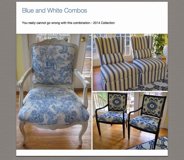
And here are some of my prior year favorites in stripes - I just cannot get enough of this look!

Great chairs - all!