 |
| Front of Show House |
Yesterday, on a hot spring Sunday (almost 90 degrees), my husband and I visited the 42nd Annual Decorator's Show House and Gardens presented by the Atlanta Symphony Associates. The house is called "Knollwood" and it is located in the Buckhead area of Atlanta - right next to the governor's mansion. If this description sounds at all familiar to my blog readers, I have written about an estate sale to this
exact home in December
link to blog. Amazingly, this house which was wonderful even then but needed extensive remodeling and updating was thoroughly and amazingly redone in that timeframe. Some of the designers who worked on the house told me that they did not get into the home until February or even April - the interior was dramatically changed!
Built in the 1920's by famed architect, Philip Trammell Schutze (had just finished the Swanhouse
link to Atlanta History Center website), the house is modeled after several English estates. The house is a beautiful example of classic architecture.
As I entered the home, I asked if I could take photos - I had not brought my "good camera" but my everyday working digital that is less obtrusive. I was told that they did not mind (although official policy evidently was to discourage photography). I did ask each designer/room coordinator for permission and they encouraged me to take the pictures which I did discreetly - not my best work but you will get the idea of how great this house looks! I am sure there will be several decorating magazines who will do the interior justice with their descriptions and photos but here goes the preview!
 |
| This was one of my favorite rooms. The colors were peaceful - a lot of what I would describe as a warm oatmeal. The glass desk embraced by two French style chairs was very fresh looking. Also, the designer indicated that he had designed it to be more a display area for art than for books - a lovely setting! |
 |
| The solarium/sunroom was set up as two spaces with a large round table in between. A black and white theme that worked well with all the green evident inside and out! I liked the placement of some larger hard pieces in front of the expansive windows which complemented the height of the space! |
 |
| The living room also included two seating areas - it was long and wide. The neutral colors with pops of color worked well in the space and with the oversized oriental carpet. Lots of blue and white ceramic accessories - which I love. The room was set up very traditionally and symmetrically! |
 |
| The huge dining room was set up for two settings with round tables on each side as well as curved banquettes. It was done well and non-traditionally. I was told that this designer (Caroline Weaks) had been selected by the new owner to do the whole house so this may be a good preview of the style that may be used throughout! |
 |
| The kitchen eating area was just wonderful with a large table and settees on both ends in a crisp yellow-green. I wished I had taken photos of the cabinetry and custom finished - thought I had but I guess not! This was a beautiful space which I would not change one bit! |
 |
| This was another great room. I loved some of the details such as the wall of black and white images behind the chairs. Several of us in the room commented that we knew how to create the stacked book look behind the black chair and even had the odds and ends books to do so, but were not sure it worked! |
 |
| The guest room was very small but beautifully appointed. I loved the variety of seating options as well as the use of an oversized gentleman's chest (see last photo) in this smaller space - it did make the space look bigger! |
 |
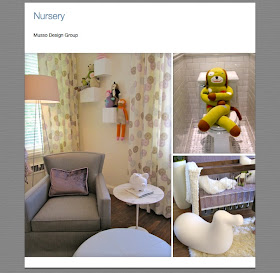
The nursery was very sweet! I liked the use of lavender and "sock animals"!
|
 |
| I am always on the lookout for "chair ideas" and saw many in this home. Here are some of my favorites - comfortable looking but a little edgy - ikats, neutrals and graphics! |
 |
This man-cave was amazing as was the very petite young decorator who had executed it! My husband was spooked at how well she seemed to understand the male psyche!
|
 |
| Back of house with yours truly! |
 |
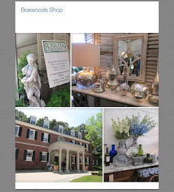
| Tempted to shop - but didn't - some great items for sale! |


Make sure you include prices of the items so you offer an idea of the discount countertops. Upon having gathered a lot of ideas about your new kitchen, grab a pencil and start to write down the costs of every item you want to consist of.
ReplyDelete