Welcome

Thank you for visiting my blog. I hope you find interesting ideas and inspiring images. Any feedback or suggestions would be appreciated! Check out my facebook page.

About Me

My photo
My name is Gerrie Wydeven doing-business-as Wydeven Designs. I have been conducting this small GREEN business since 2004. Wydeven Designs, based in the Atlanta, Georgia area, sells CHAIRS, LOVESEATS, CHAISES, SETTEES and other fine, well-constructed refurbished upholstered pieces. I love to travel, cook, take photographs and generally follow style and decor topics as well!

Tuesday, November 5, 2013

Travels in Georgia - Fall Foliage at Gibbs Gardens

Entrance to Gibbs Gardens
Last Sunday was such a perfect day here in the greater Atlanta area of Georgia, that I suggested we take a drive to Gibbs Gardens link to website - about an hour north of our home and located in Ball Ground, Georgia. We learned that their hours start at 9:00 and arrived soon thereafter.  The Gardens are having a "Japanese Maple" Festival through mid-November to highlight the beautiful colors of these maple trees as they are changing - a riotous blend of oranges, reds, and yellows.  We discussed getting an annual membership pass ($100) but decided to just go for the day ($40 for two) and were told this would apply toward the pass if we wanted to purchase before leaving for the day.

The colors in the gardens were at peak - in other words, spectacular. Jim Gibbs, the proud owner of this wonderful setting was holding court in the welcome center and enthusiastically describing his gardens.

Here are some of the 150 photos we took. There were "serious" photographers with "serious" photographic equipment throughout the gardens. After looking through these photos, you will understand that we did in fact convert our day passes to an annual pass. The next big events is the Yellow Daffodil Festival in February - we can't wait!

Lilly ponds near the entrance 
Foliage reflected in the ponds 
"Monet's Bridge" fashioned after the famous artist's bridge in Givency, France 


Multi-trunked tree using green filter on camera 
Entrance to Japanese Gardens at Gibbs Gardens 


Jim Gibb's house on the property - we were invited to "peek in"
I could be at home here! 

Friday, November 1, 2013

Upholstery Techniques - Tufting


Tufted-back armchair - link to my pinterest board - Upholstery Treatments
Performing the task of upholstering fine furniture requires a significant set of skills (and strength) and I leave this important work to the masters (my go-to upholsterers are the fabulous Lees of Sun's Upholstery in Norcross, GA). One of the trickier techniques is tufting and, I must admit, one that Mr. Lee is not too fond of because it requires a high degree of precision and patience and must be done with the right fabric.

Tufting is the practice of pulling, folding or sewing in a contoured pattern, in two basic geometric shapes—diamond and square (biscuit). Like the majority of upholstery work, you are taking a two-dimensional item, fabric, and putting it on a three-dimensional item, a piece of furniture. To achieve the desired end result, the fabric must be sewn, tucked, gathered, pleated or folded. link to article
The description above does give a sense of the difficulty of this technique. First of all, why use this technique in the first place:

  • Tufting allows the piece to have a natural curve that would be hard to duplicate without tufting. The chair above provides a good example of this principle - it it hard to imagine this chair without the tufting - it would, in essence, be a much different style chair.
  • Tufting provides for texture and interest in an otherwise simpler piece of furniture. Tufting used on top of a round or other-shaped ottoman is an example of this principle - without the tufting, the pieces would be quite plain. This is also a good reason many upholstered headboards are tufted.
Tufted ottoman - link to source
The issue of fabric selection is quite critical. It must be right in terms of scale (either solid or small pattern because tufting will distort any pattern) and right in terms of texture (neither too stiff or too loose - soft, loose chenilles do not make good tufting fabrics). The fabric must also "give" meaning that it can be stretched which eliminates silks since they do not stretch at all.  

A moderate tufting technique is to use buttons on the back to achieve some of the same "rounding" and "shaping" options that can be achieved by a deeper tufting technique but can be done more easily. This is often the compromise I reach with Mr. Lee if it makes sense for a piece.  
 
Here are some examples of tufted pieces - both from my pinterest board - check here and from my own photo archives. I do not ask for tufting unless the piece I am redoing is already tufted. It is a nice technique but not necessary on most pieces. It is also a premium technique meaning I pay more (and have to charge more) for the furniture.

I have not "done" one of these type of chaises but after seeing this one decided I need to be on the "look-out" for one - love how this looks - see source above. 
Here is an example of a more subtle tufting technique. Since the tufting is not required to create a rounded look on the back, a simpler button approach with less depth can be used - see source above. 
This chair illustrates the deeper tufting as well as another premium technique - use of nailheads as accents - see source above.
Only the round chairs from my 2012 collection shown here really "needed" the tufting to achieve the rounded back - the others were just decorative.
Here are some examples of the deeper tufting technique including on a round ottoman which was custom made for a client. 
I found some good sources of "how to's" and further descriptions of this technique:


Monday, October 28, 2013

Loving Annie Sloan Chalk Paint's Emperor Silk!

Red on this camper is ASCP Emperor's Silk (five colors used altogether) - link to image and source
Having recently returned from China (see my "postcards from China series - here is one - link to posting), I must still be under that country's magical influence. I purchased Annie Sloan Chalk Paint (ASCP) (link to website) most "Chinese" color - Emperor's Silk. It is a rich red and a joy to work with - I have almost completed four projects and am looking around for more!

For those keeping track, I have now been using ASCP for two years - mostly on my refurbished upholstered furniture sold through eBay and Etsy (my website, unfortunately, needs to be "killed"since I can no longer update it and it is woe-fully out-of-date). I am probably close to a hundred projects and have used the following colors:

Old White (I'm on my third can)
Old Ochre (second can)
Graphite (third can)
Duck Egg Blue (my favorite until now)
Paris Grey (least favorite)
Chateau Grey (like a grey-green)
Cream
CoCo
Emperor's Silk (new favorite)

The paint does go on very smoothly and I continue to fine-tune lessons learned including:
  • Start with a good cleaning of the wood to eliminate dust and oils (I used Goof-Off - link to website - it's heavy-duty and you do need heavy gloves but it works.
  • If there are gaps or gouges in the wood, fill them before painting - the paint will not hide them and will actually highlight them.
  • Do your first coat starting with the piece upside down - I am always amazed at how much I miss if I don't do this. 
  • Dilute the paint with a small amount of water if it gets too heavy or doesn't glide easily over the surface.
  • Use a toothbrush or other stiff applicator when applying wax into crevices - I am told the ASCP brushes work well for this but haven't made that purchase and do like the ability to just throw away these old toothbrushes when done - clean-up of wax is much tougher than clean-up of paint  which is easily done by rinsing under water.
Here are some photos from my ASCP pinterest board to further inspire - I love them - see sources and original postings by linking to source above.

Nice combo of paint and wood-tone treatments. 
This is demonstration using dark wax directly over the paint instead of intermediate clear wax - much darker look. 
Chest using both clear and dark wax. 

Very ambitious! 

This piece was first done with graphite (grey-black) and a second coat of Emperor's Silk added.


Here are my projects!


After "finishing" this set of benches, I did end up taking a very small brush to better hit the crevices/details on the legs - these were hard to penetrate. 

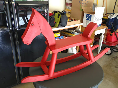
Loved how the horse turned out - will be using as part of my holiday decorations - probably with some bears on its back!

Thursday, October 24, 2013

Postcards from China - Beijing

During our stay in Beijing, we visited the Sacred Way of the Ming Tombs which is really just a nice stroll along a shaded path with monuments/sculptures. The tombs themselves are not readily accessible. Our guide, Jane, stood at the same spot that Chairman Mao had been photographed at in the 1950's - this was one of his favorite destinations in China.
It has almost been a month since my husband and I returned from a Viking River Cruise trip to China - a journey of a lifetime. I have shared glimpses of this experience using a photographic "postcard" convention. This is the last of the series and features our last stop in China, the capital city of Beijing.

Beijing is the second largest city in China (after Shanghai) and has a 2000 plus year history.

From Wikitravel:
Beijing literally means Northern Capital, a role it has played many times in China's long history. Beijing's history dates back several thousand years but it first became notable in Chinese history after it was made the capital of the State of Yan under the name Yanjing. Yan was one of the major kingdoms of the Warring States Period, some 2,000 years ago.
We enjoyed our visit and felt we could have stayed much longer and seen much more. We were told the subway system was very well laid out and extensive and easy to use. We did note that traffic was horrible and doubt if we would have rented a car and tried to join in the fray.

Here are some highlights - we really enjoyed this trip and, unfortunately, it is still on our bucket list for more extensive exploration. We are finding that our bucket list gets longer and longer the more we travel!

We traveled with our tour group and guide "Jane" to the Great Wall of China in the Badeling area - a popular Beijing destination north of the city. We were there early in the morning and had an opportunity to see it before crowds arrived. It is amazing!
After visiting the wall, we had a tour of a nearby jade factory and had lunch on the premises. We bought this "Happiness Ball" and have it as a great memory of this trip!
On the next day, we traveled to Tiananmen Square, again fairly early in the morning. The square was being prepared for a distinguished guest visit and we heard that it was closed to other visitors starting closer to noon. We were happy that our guide had arranged this early morning visit. 
The entrance to the Forbidden City is off of the square through the Gate of Heavenly Peace.
The Chinese are very fond of rock gardens and see many images in them.  
The visit to the Summer Palace was our last in China - it is a popular local tourist site.


Wednesday, October 16, 2013

Pretty in Pink - In Honor of Breast Cancer Awareness Month


Images of "pink" items used in home decor - courtesy House Beautiful - link to my pinterest board for source information - all images in this posting are found here.
Chair I wish I had in inventory
It is October - Breast Cancer Awareness Month - and each year I do a posting on "pink" used in decorating. I am sure there is a story behind the symbolic use of pink for this campaign but don't know what that story is. It is very gratifying to see the kind of progress that has been made on this horrible set of diseases and I know many breast cancer survivors personally - a wonderful cause!

I do not have any "pink" items in my own Wydeven Designs inventory and must admit that I am a little nervous about having a too "girly" look. I did just sell my last pink-like (raspberry) chair - a wonderful cut-velvet wingback - to a college student (and mother of college student) in Austin, TX. Looking at the images I found for this posting and the articles - outlined below - encourages me to go out and find more usable pink-red fabrics.  They truly are beautiful!
Some colors relax, others excite; pink does both. It provokes romance and glamour, and it is the color of love's first blush. Pink delivers feel-good emotion in the same way that a ranunculus blooms, one layer at a time. Give in to pink's pretty power. link to article
House Beautiful's article about how to use pink in decorating has some great suggestions - here is a sample:
  • Use Pink as a Surprise
  • Choose a Pink with Purple Tones
  • Try Deep Pink in the Dining Room
  • Add Pink to Energize a Space
  • Pair Pink with a Metallic link to article

Love this low-key light pink and neutrals combination! 

My kind of sofa!
This room setting shows how well pinks work with black and white (and of course, green)!
Sweet setting - I would definitely want that pink settee in my inventory!
I don't know about the mix of orange and pink here although I do love the cool grey tones.
Love this!
This photo reminds me of my family room in our last home which was painted a deep pink color - my favorite room in that house!

Another wonderful visit to the world of "pink" in decorating.  Here are some other articles that I found - some very interesting ideas here! ENJOY!